Design is much more than decoration. Good technology design is ultimately about helping the user do their job, and do it well. Bad design hinders the user and, in some cases, can lead to nothing less than catastrophe.
By Julia Stoops.
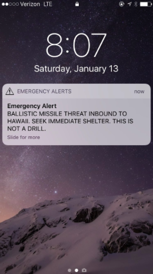
On January 13, over a million people in Hawaii received an automated alert that a ballistic missile was approaching the islands. Television and radio stations in turn broadcast the warning. It took the Hawaiian Emergency Management Agency (HIEMA) 38 excruciating minutes to correct the alert with a second false alarm message. In the meantime, Hawaiians were suspended in a terrifying state of limbo while sirens across the state blared – all within the context of the U.S.’s deteriorating relations with North Korea.
“Human error” is blamed for the alert, but a photo of the missile alert system as seen on a computer screen reveals an interface designed for total failure.
Hawaii State officials now say the photo it earlier sent to Honolulu Civil Beat was “merely an example” of the alert system user interface, and is not the actual interface used by the operator who sent the alert. They issued another “example” that is also not the actual interface the operator used, citing “security reasons” for why they can’t show the actual interface.
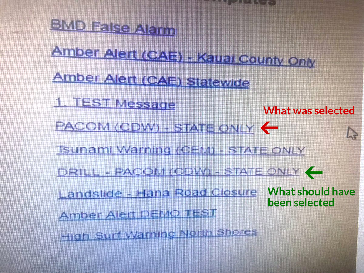
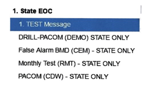
The second interface “example” does not redeem the first. Both have egregious design flaws. Both doom any user to make the wrong choice. Additionally, the system did not allow for an easy retraction of an incorrect alert, which led to the 38-minute delay in the official reversal from HIEMA.
Regardless of whether either of these photos depict the exact interface the operator used, they both show the operator’s options as a list of confusing titles, set in no particular order, with no indication of hierarchy. The option to warn citizens about a road closure is visually no different from the option to warn citizens that WWIII is about to begin right here, right now. Additionally, there is a one-word difference between sending a test missile alert and a real one, and neither option has any indication of the danger of making the wrong choice.
“Good technology design is ultimately about helping the user do their job, and do it well.”
The operator who clicked the link that terrorized a million people has been reassigned within the agency and his status is under review. He apparently “feels terrible” about the mistake. And the agency says now it will require two people to send such an alert, and has implemented a button to automatically retract alerts issued in error. But this is not enough.
The blame falls on whichever decision-makers thought this (or something like it) was a good enough interface for a critical alert system. The blame falls on the all-too-common assumption in some quarters that investment in “design” means paying for unnecessary window dressing for the trained personnel manning such systems.
Fairpixels posted this excellent redesign of the emergency alert system interface. They created it in an evening, and while they don’t claim it’s perfect, it’s a thousand percent better than what evidently exists. It features clear calls-to-action, clear separation between drills and real-world alerts, multiple steps and opportunities for the user to check whether they’re making the correct choice, and a visual display of the wording of the alert they are about to send.
If Fairpixels’ redesign was the interface the operator used, and he still sent out the wrong alert, I’d agree with the diagnosis of “human error.” But whichever “example” of the interface the operator really used, they were set up to fail. That person is living with the knowledge that their wrong click sent a million people into a state of panic and confusion. And the residents of Hawaii are living with the trauma induced by believing, if only for half an hour, that they were about to be destroyed by a nuclear bomb.
C’mon, government! We can do better than this. Bad UX and UI are not hard to fix. Let’s encourage a culture that values good UX and UI design as vital to safety, efficiency and prosperity.