Interactive maps deliver complex information to users in easy-to-digest ways. Like a modern-day Gesamtkunstwerk – an artwork that combines several types of art forms – maps orchestrate multiple modes of communication to convey information. This enables users to synthesize their visual, verbal, spatial and navigation skills in ways that speeds up their comprehension of otherwise layered and nuanced data. Also, exploring maps is fun! Here at Gard we’ve had the opportunity to custom-build some really interesting mapping solutions for clients.
By Julia Stoops.
Exploring Governments That Serve You
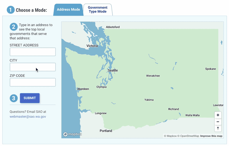
The Washington State Auditor’s Office (SAO) sits on a goldmine of data about the finances of every single local government – from the smallest volunteer fire district to the largest county – in the state of Washington. In the spirit of transparency, the SAO wanted this financial information to be easily accessible to anyone who wants to know, particularly Washington taxpayers and journalists who have a special interest in such a resource.
As part of an overall website redesign and rebuild for SAO, we developed an interactive map of Washington State that allows visitors to type in an address to see the financial information of the various government entities – county, city, school district, etc. – serving that location. Users can filter by government type to compare, for example, the revenue and expenditures of every library district in the state. The map also allows users to download full audit reports from each government entity.
We built the map using JavaScript and the mapping tool MapBox. The data was provided by SAO’s partners, and included multiple years of financial information, as well as shapefile data defining the precise geographical area served by the each of the 2000-plus Washington state governments. We handled the technical challenge of such a large dataset by pre-loading the shapefile data into the map, thus making the map controls feel quick and responsive. On the other hand, the financial details load only when the user chooses to see them.
Now the citizens of Washington State can see where their tax dollars are going. SAO’s priority is to inform and empower citizens, and the map makes transparent a type of information that from most governments is available only via FOIA requests.
Finding Gas Stations and Convenience Stores in the Northeast
Global Partners is a fuel distribution company that has traditionally supplied diverse clients such as municipal fleets and the shipping industry. In recent years they have expanded their business lines to include gas stations and convenience stores in the Northeastern US that they own or lease. Since many of these 2000+ locations come with an existing fuel or store brand, one of Global’s challenges is to make visible their extensive network in the region.
As part of an overall website redesign and rebuild for Global, we developed a map of retail stations where users can find locations by searching the map using multiple filters alone or in combination. For instance, a search for “New York”, “Diesel” and “Exxon” yields a handful of results, each of which can be opened to display a modal window with the location’s address, other fuels they carry, and a link for directions.
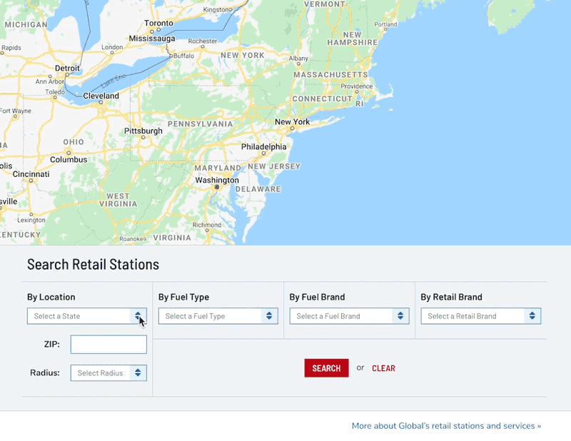
We built this map using Google Maps, and the locations data is fed via a simple spreadsheet. We created a custom uploader within WordPress to enable the easy refresh of data any time Global wants to update the map. Global’s network of retail stations changes frequently as locations are bought and sold, and the newest information is uploadable by Global staff in a simple two-click process.
One UX challenge we overcame was making the map very mobile-friendly. The interface contains multiple filter choices that take up most of the screen real estate on a phone. This means the user can’t see all the filter choices and all of the map in the same view. To get around the disconnect, we used JavaScript to automatically scroll the screen back up to the full map view after a user has clicked the Search button. This gives the user crucial feedback that their action had an effect.
Designed primarily for B-to-B users such as potential station owners or lessees, investors and those in real estate, the map allows users to see the breadth of Global’s reach in the retail location space, and the diversity of brand partners they work with.
For centuries, maps have played in important role in how we understand our world. Interactive maps have the power to deliver highly detailed and nuanced information on demand, but can be subject to pitfalls such as slow load times and a crowded interface. Maps should be a pleasure to use. We love the challenge each map project presents, as we keep usability for our clients and their users top-of-mind, while we work out the technical challenges behind the scenes.